
WELND website design: a considered website for a finance brand
WELND · Finance and lending · Australia
The short version · Website delivery
WELND’s current website combines a warm visual identity with clear debt and lending categories, useful resources and a choice between exploring or contacting a broker.
Website showcase
A closer look at the website.
Explore WELND's website, from the first impression to the details.
Use the left and right arrow keys to browse screenshots. Home goes to the first screenshot and End goes to the last.
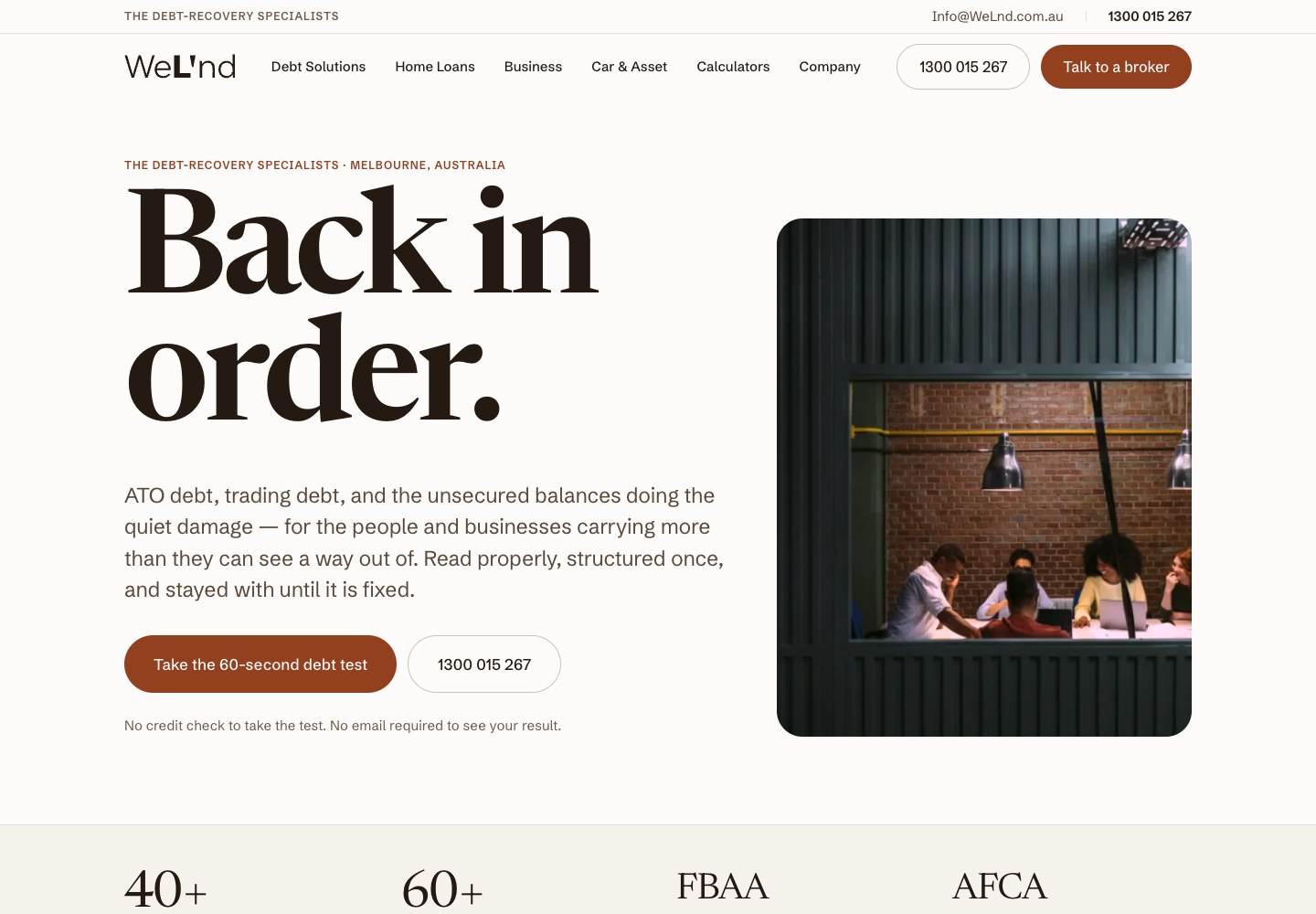
01 / 02 · Desktop — a clear service promise, visible contact options and the client’s own identity.
The case study
Inside the build for WELND.
The short list
- The current wordmark, bark-coloured type and warm background create a distinctive finance identity.
- Debt services lead the introduction, with other lending categories organised in navigation.
- A debt test, calculators and direct contact provide different ways to begin.
The design choices and customer journey behind this website.
Give the current WELND brand a clear digital home
WELND’s current website brings a distinctive finance brand into a calm, readable online experience. SoudCoh’s website-development work places the debt-solutions offer at the front, with separate navigation for home loans, business finance and car and asset lending. The opening message addresses the customer’s situation before asking them to begin a conversation.
A considered visual identity
The site uses a warm white background, dark bark-coloured type and rust-coloured action buttons. Large serif headings give the page its character, while generous spacing keeps the supporting explanation readable. The current WeL’nd wordmark leads the desktop header; the compact brand mark appears on mobile.
The main photograph balances the opening text without competing with the next step. ATO debt, trading debt and unsecured balances are named in the introduction, making the debt-services focus concrete. The surrounding navigation gives the broader lending offer an organised place in the same website.
Offer more than one starting point
The homepage presents a short debt test alongside a phone option, with an explanation of what the visitor needs to provide. Someone ready to speak can contact a broker; someone still exploring can begin with the test. The choice lets the customer approach the business at a pace that suits them.
Calculators also have a dedicated place in the navigation. Together with the service categories, they give the site useful depth beyond a single contact form. The design makes those resources visible while keeping the opening page focused on the central debt-solutions message.
Keep the conversation clear on every screen
On mobile, the main explanation and debt-test button stack vertically, followed by the phone option. The smaller header retains a number and menu control. The typography and spacing carry the same brand character into the narrower layout.
WELND’s wider SoudCoh engagement includes paid social, so the website also provides the next destination after an advertisement. Read the WELND campaign case study for how the message, website and enquiry journey work together.
Tags
- Finance and lending
- Australia
A website built around your business.
Tell us about your services, your customers and the next step you want them to take. We will shape the design and page structure around that brief.
The questions this raises.
The brief, the design and how the website supports the wider customer journey.
The first call is free and there is no deck.
Book a callHow does WELND’s website introduce its finance services?
The homepage starts with debt solutions and names ATO debt, trading debt and unsecured balances. Separate navigation gives home loans, business finance and car and asset lending their own routes.
Why offer a debt test as well as broker contact?
The website gives visitors a choice of starting points. They can explore the test before making contact or use the prominent phone and broker-contact options when ready for a conversation.
More accounts, same discipline.
Studies from the same kind of work, so you can see how the pattern holds across different businesses.
Website Development
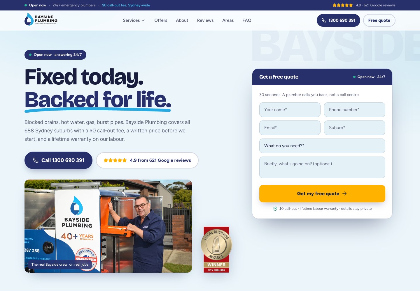
Bayside Plumbing website design: a premium plumbing website built for the first call
Bayside Plumbing website design by SoudCoh: a clearer brand, useful page content and a considered mobile enquiry journey.
Read case study
Finance
WELND: paid social and a website built for the lending conversation
How SoudCoh connects WELND’s paid social creative, website and enquiry journey for finance lead generation.
Read case study
Plumbing
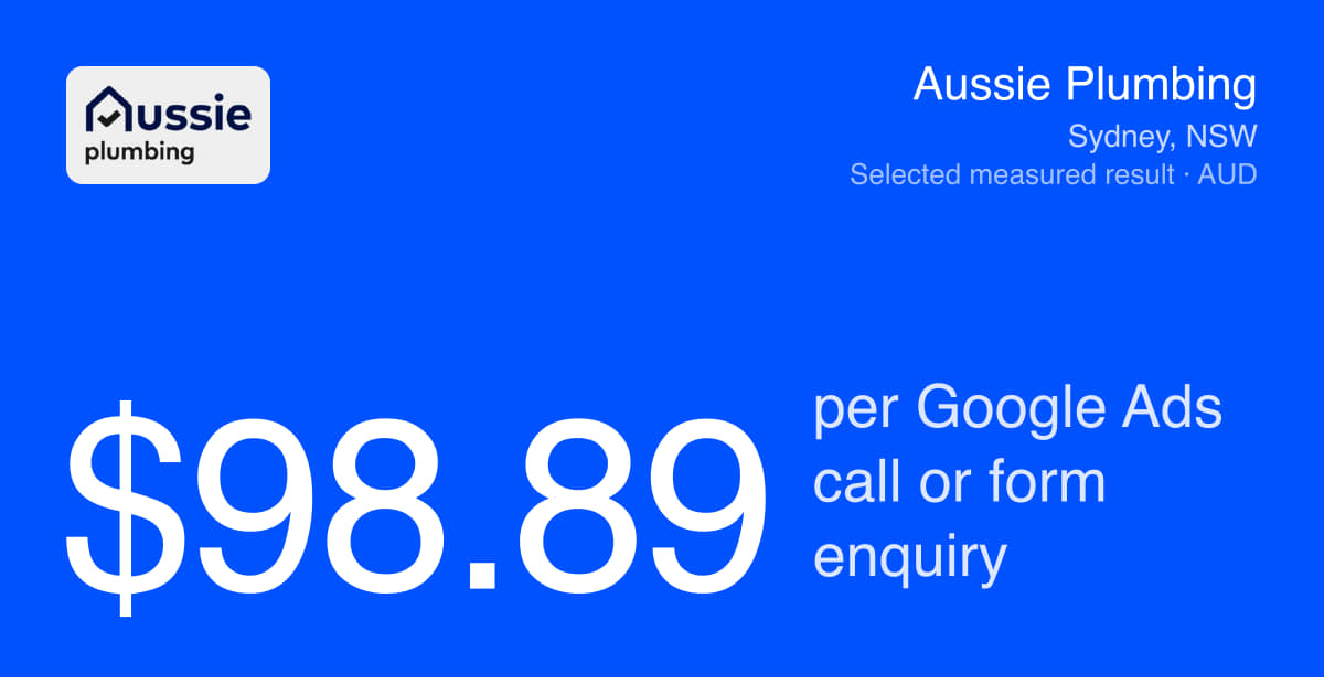
Aussie Plumbing: $98.89 per Google Ads call or form enquiry
Aussie Plumbing recorded $98.89 per Google Ads call or form enquiry. See how SoudCoh connects service-led campaigns, websites and enquiry reporting.
Read case study
The work that produced this.
Explore the design, content and enquiry tracking services behind a website like this.
- What this looks like for other finance and mortgage brokersThe same work written up for finance and mortgage brokers specifically — what an enquiry tends to cost in this trade, where it comes from, and what a business your size should expect from it.
- Website design and developmentBrand presentation, service pages and mobile contact journeys built around the way customers choose a business.
- Search visibility for a growing websiteUseful service and location content, with a structure that helps people and search engines find the right page.
- Tracking website enquiriesConnect phone calls and form submissions to the advertising that brought a customer to the website.
The briefing behind the work.
Further reading on the decisions that connect a website with the wider marketing work.
Why the primary and secondary categories must match the work a business actually wants. That case is argued in Google Business Profile categories as a silent rank constraint.
The profile and service-area rules for the mobile businesses represented throughout this library. The other half of it is set out in Ranking a service-area business without publishing a storefront.
The work behind this one is written up in full under what this looks like for other finance and mortgage brokers, and the ninety-day plan that produced results like these sets out the sequence in order.
Ready for your next website?
Tell us about your business, your services and what your website needs to do. We’ll help you decide what to build next.
A clear scope, a considered design and a practical next step.