Regional Victorian shire · Local government · Wimmera region, Victoria
Design approach
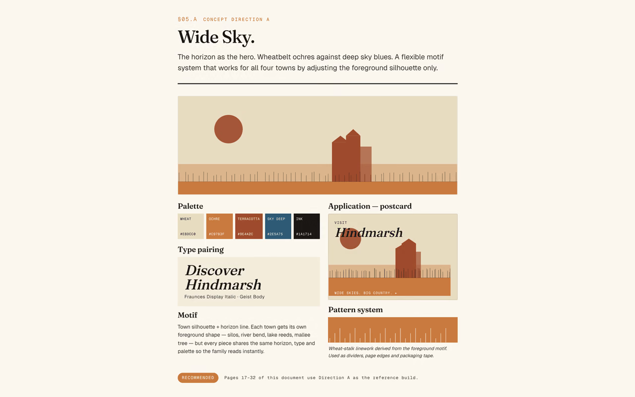
Concept — Direction A — Wide Sky · wheatbelt palette + Fraunces / Geist type
1 / 10
Visitor identity, guides and wayfinding.
A design approach for presenting a region’s towns, attractions and visitor routes as a connected experience. We can develop a visitor identity alongside an existing corporate brand, with guide layouts, maps, signage and campaign applications.
The design challenge
A region presented through separate materials.
Visitors need a clear way to understand the places, activities and routes on offer. A shared design system can connect publications, signs and digital information without removing each town’s character.
Our approach
Show the identity in the places people use it.
Develop visual directions through guide covers and sample spreads, maps, signs and campaign layouts. Review the applications together before preparing production files.
What we can deliver
- Visitor-brand directions and design guidelines
- Guide covers and sample publication spreads
- Tourism maps and route information
- Signage and wayfinding concepts
- Fleet, social and merchandise applications
- Editable design files and production planning