
    Proof
    Impress Blinds — cost per recorded Google Ads conversion down 62.63%SLS Solicitors — cost per recorded Google Ads conversion down 58.48%FixCare Property — cost per enquiry down 56.36%Rubbish Removal WA — cost per enquiry down 53.18%Floral Cakery — cost per enquiry down 49.82%ILLUMINATE Laser Emporium — cost per enquiry down 48.54%Aussie Plumbing — cost per enquiry down 41.96%Sydney Fence Painting — cost per enquiry down 33.68%Alliance Plumbing — cost per enquiry down 29.6%Gridless Build Solutions — cost per enquiry down 29.16%FacilityWorx — cost per enquiry down 23.62%Cornerstone Roofing — cost per enquiry down 20.47%Council finance — budgeting and workforce designCouncil planning — clearer approvals and reportingCultural audiences — media strategy and creative conceptsCommunity participation — surveys, maps and project pagesPublic-sector research — survey design and analysisPublic art — site studies and visual conceptsRegional identity — visitor guides and wayfinding conceptsCouncil systems — integration and migration planningA pressure washing business — service-led search campaignsA pressure washing business — a clear enquiry journeyA carpet cleaner — Google Ads built around cleaning servicesA roofing company — campaigns for repairs and restorationA CCTV installer — campaigns for security enquiriesA fence painter — search campaigns for specific surfacesA maintenance business — live in 8 weeks, 3 stacks gone41 numbered clauses, published in full5.0 across every Google review$120M+ in media under management250+ active engagements across five countries
    Government & Public Sector

    A clearer brand for a public service

    A public service can have a recognisable logo and still be difficult to explain. People encounter its signs, forms, event notices and website at different times. A useful identity connects those encounters, helping them recognise the service and understand what it offers.

    • 23 September 2026
    • 3 min read
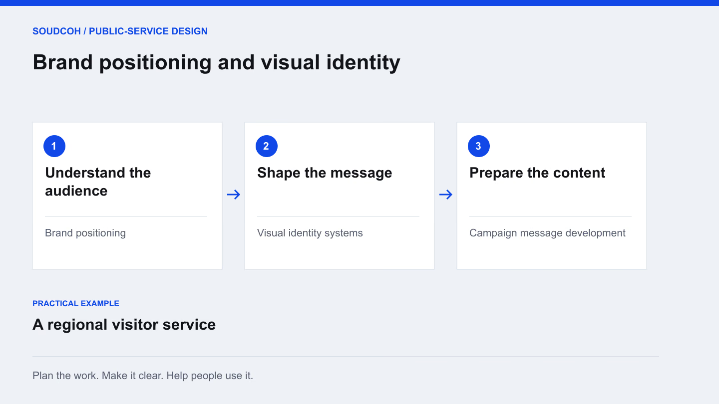
    Brand positioning and visual identity: understand the audience, then shape the message, then prepare the content.
    An example approach for a regional visitor service.

    The steps

    From a shared story to everyday materials

    A working approach for a regional visitor service.

    UnderstandStart with the place and its visitorsDevelopTest the identity where it will appearHand overMake consistency practical

    Understand

    Review the audience, the setting and the publications people already use. Agree the story the service needs to tell before choosing a visual direction.

    Ready for the next stepA positioning brief

    Develop

    Compare distinct concepts on a guide, a sign and a digital template. Judge whether the same message remains clear across those everyday applications.

    Ready for the next stepA chosen identity and application designs

    Hand over

    Document type, colour and layout choices. Provide editable templates and clear instructions so the team can maintain the identity across future materials.

    Ready for the next stepA usable guide and template library

    Start with the service promise

    Before choosing colours, write down who the service is for, what people can expect and what they should do next. A visitor service might help someone plan a day out. A community programme might need to explain eligibility and how to join. Those are different communication jobs, even when they sit under the same organisation.

    Ask staff which questions they repeatedly answer. Review the material people actually receive. This gives the identity work a practical purpose and prevents a new visual style from carrying the same confusing explanation.

    Build on what people already recognise

    A refresh does not always need a new name or logo. Existing recognition may be valuable, particularly when the public already connects a symbol with a trusted service. Examine what can stay and what needs clearer rules: headings, photography, colour use, tone or the relationship between a parent organisation and a programme.

    For a regional visitor service, the useful change might be a shared layout across several town guides. Each place keeps its character while maps, opening information and visitor advice become easier to follow.

    Compare directions in real applications

    A mood board gives an impression; an application shows whether the idea works. Develop a small number of distinct directions and apply each to the same practical items. A guide cover, mobile page, poster and sign can expose different strengths and weaknesses.

    Judge each direction against the brief. Can someone recognise the service? Is the important message readable? Does the system accommodate a long place name or a translated heading? Record the reasons for the decision so later design choices follow an agreed purpose rather than personal preference.

    Give the team tools it can use

    The handover should cover the materials staff produce repeatedly. This might include presentation layouts, social tiles, an email heading, event posters and a simple document template. Explain which elements can change and which should remain consistent.

    A compact guide with worked examples is often more useful than a large collection of rules with no examples. Include correct and incorrect applications, file formats and instructions for choosing imagery. Make sure the people maintaining the service can find the current files without asking the original designer each time.

    Test the identity beyond launch day

    Use the system on an ordinary piece of work before expanding it. A routine notice, a longer publication and a small-screen page will test different constraints. Ask someone unfamiliar with the project to explain what the material tells them and what they would do next.

    The output is a coordinated identity, a set of usable applications and a clear way to maintain them. Review the templates when the service changes, rather than letting outdated messages persist inside a visually consistent design.

    Explore our Brand positioning and visual identity, related services and Turn one public-service brief into useful content.

    What to do next

    Talk to SoudCoh about the service question, the people involved and the outputs your team needs.
    Talk to SoudCoh
    Read next

    Filed under the same desk first. The full index is searchable and filters by reader.

    If you would rather we just did it.

    The briefing above is the reasoning. These are the pages that describe what it looks like as a piece of paid work, including what it costs and what gets reported.

    • Brand positioning and visual identityDevelop a clear identity for a service, destination or programme, then show how it works across everyday materials. The work connects audience needs, message, visual design and practical templates so teams can explain the same offer consistently in print, online and in public places.

    • Explore Brand positioning and visual identityExplore the people, scope and practical outputs involved.

    Apply it to your account

    Reading it is the easy half. Thirty minutes with someone who runs accounts and you leave with a written list of what is leaking on yours — yours to keep either way.

    No pitch deck. No upsell. A real conversation and a written list of leaks.