
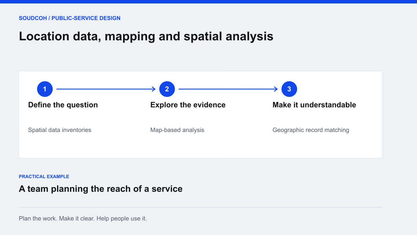
Decide what the map needs to explain
A team might need to compare service reach, understand the distribution of facilities or identify where records are missing. Those are different questions and may require different data. Write the intended decision before choosing a map style or analytical method.
For a service planning example, the team could examine the locations it currently serves alongside relevant geographic areas. The aim may be to identify questions for further investigation, rather than declare that a particular area is adequately covered. Make that distinction clear at the beginning.
Check how locations were recorded
An address, a coordinate and a named area do not carry the same precision. Review the source, age and quality of the location records. Check a sample against reliable reference information and keep unresolved matches visible.
When combining datasets, examine whether they use compatible boundaries and definitions. A comparison can be misleading if one source describes a different period or geographic unit. Record the choices made when aligning the data so someone else can understand how the map was prepared and what changed along the way.
Side by side
A location display needs an analysis behind it
A list placed on a map
- Locations without a clear service question
- Missing or uncertain records treated alike
- A visual pattern with no explanation of its limits
A useful spatial analysis
- A defined question about gaps, overlaps or reach
- Checked records with source and confidence notes
- An interpretable comparison and an update plan
Specialist engineering, surveying or safety analyses need qualified domain review before they are used for those decisions.
Show the information without hiding uncertainty
Choose symbols, labels and grouping that fit the question. Give readers enough context to understand what a colour or boundary means. Where locations or measurements are uncertain, explain that near the relevant output rather than leaving it in a distant technical appendix.
Provide a table or other view when people need exact values. A map is useful for spatial patterns, but it may not be the clearest way to compare small differences. The visual should support the analysis, rather than become the reason to make a claim the data cannot justify.
Separate useful analysis from specialist judgement
Some spatial questions involve surveying, engineering, road safety or other specialist methods. Software can prepare data, present maps and support a documented workflow, but qualified domain experts must review the relevant assumptions and conclusions.
For example, mapping a network is not the same as certifying its safety. An attractive diagram does not establish that a model is appropriate for a particular decision. Define the role of specialist review in the project scope and explain which outputs are descriptive, which are modelled and which require further assessment.
Make the work repeatable
Keep a source register, document the preparation steps and record the checks used to validate the output. Explain how the team would update the analysis when a source changes. Deliver the relevant data and useful exports alongside the visual presentation.
The practical outputs can include a prepared location dataset, maps, a validation summary and an update guide. Before handing them over, ask whether another analyst could reproduce the main result from the same information. That gives the map a stronger foundation as a continuing service-planning tool.
Explore our Location data, mapping and spatial analysis, related services and Build a dashboard people can check and use.