Snug Nest Designs: a landing page that walks you through their homes
We built Snug Nest Designs a landing page that walks visitors through 12 homes, with 21 films and one quiet way to book a call. Every active ad in the studio's Meta campaign for booked calls lands here, and every Let's talk button opens the same booking window.
Services
Landing page design and build · Project and room galleries · Build-stage advice · In-page film player · Call booking
Each figure names the window it covers. Use the info button on a tile to see how it was measured.
Headline result
12
homes to walk through on one page, from the first screen to the room views
Live landing page
How it was measured
Distinct projects named on the live landing page: the first screen, the opening collage, Explore the homes and every room type in A closer look at the rooms.
21
films that play on the page, twenty of them under a minute
Live landing page
How it was measured
Films with a play button on the live landing page, counted across all four build stages and all four question topics. Twenty show a running time under a minute; the client story shows none.
4
build stages, each with its own advice, a founder film and a way to book
Live landing page
How it was measured
Stages in Where are you in your build? on the live landing page, each selected in turn.
16
room views to compare across kitchens, living spaces, bedrooms, bathrooms and workspaces
Live landing page
How it was measured
Project views listed under each of the five room types in A closer look at the rooms, on the live landing page.
30 min
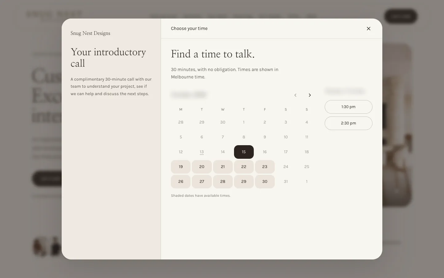
complimentary introductory call, booked in Melbourne time without leaving the page
Booking window
How it was measured
The booking window opened from each Let's talk button on the live landing page and captured without booking.
How we measured +
Counts were taken on the live landing page at book.snugnestdesigns.com. Homes are the distinct projects named on the page. Films are those with a play button, counted across all four build stages and all four question topics. Room views are the projects listed under each of the five room types. Every Let's talk button was clicked and each opened the same booking window; nothing was booked, and the calendar's month is softened in the screenshot. The active-ad figure is the number of active ads in the studio's Meta campaign for booked calls when the page was captured, all pointing to this page. Screens were captured at desktop width and on a phone-sized screen with the privacy choice declined and no request sent to Meta. No visit, booking or speed figures are claimed.
In one minute
The 60-second version
Snug Nest Designs, from the brief to the result in 5 short slides.
01 The studio
A Melbourne studio for custom and boutique homes
Snug Nest Designs creates interiors for custom and boutique homes, from the first floor plan to the final piece of furniture, with materials and custom pieces sourced from international makers.
02 The problem with a generic page
A list of services cannot show how a home will feel
Someone choosing a designer for a custom home wants to see the rooms, hear how the team thinks and know what the first call involves. A page of services and a form shows none of it.
03 The idea
Let the homes do the talking
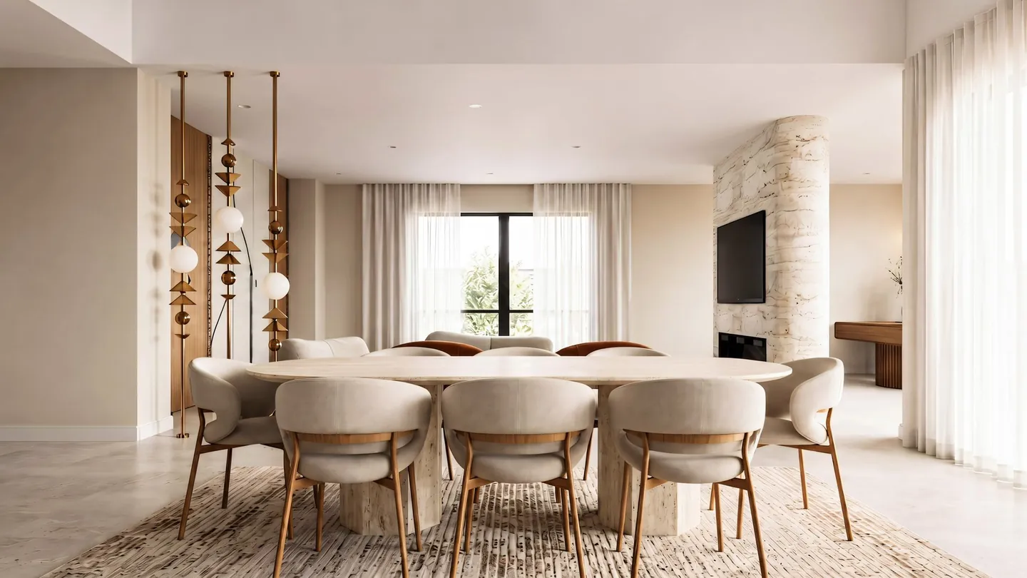
The page opens on a dining room from Contemporary Oasis and keeps returning to the work: a collage of three homes, six homes to explore, then sixteen room views. Twelve homes in all.
12homes on one landing page
04 The craft
Quiet type, honest labels and films that play in place
Light serif headlines on a warm, pale ground. Rooms sit side by side by type, collage images are labelled photograph or design visualisation, and films play in a window with a transcript.
21films that play on the page
05 Where the ads land
Every active ad in the studio's Meta campaign lands here
The campaign for booked calls sends all of its active ads to this page. The first screen holds the headline, the work, Let's talk and a plain privacy choice: you can book either way.
86active Meta ads pointing to this page when captured
01 / 05
Insights
What the data showed
What Snug Nest Designs’ own records showed once the work was live. Open a card for the full finding and how it was measured.
The build01
12 of 21
Most of the 21 films are the founder answering a question a client would ask.
Founder answers57%
Build-stage advice19%
Sourcing trips14%
Studio and client story10%
Twelve of the films sit under Questions we hear often, three to a topic, each with its written answer beneath. The rest show the work in context: advice for each build stage, sourcing trips, a colour appointment and a client family's story. A visitor can hear how the studio thinks before booking a call.
How it was measured. Films with a play button on the live landing page, counted across all four build stages and all four question topics, grouped by section. Shares of 21, rounded to whole percentages.
The build02
4 stages
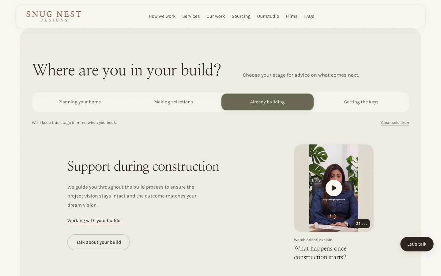
Choosing a build stage changes the advice, the founder film and the button beneath it.
Planning your home, making selections, already building and getting the keys each bring up their own heading, advice and a founder film of 20 to 28 seconds. The button reads Talk about your build, or Talk about your home once the keys are in hand, and the page notes that the chosen stage is kept in mind at booking.
How it was measured. Checked on the live landing page by selecting each stage in turn.
The build03
16
Sixteen room views across five room types let a visitor compare homes like for like.
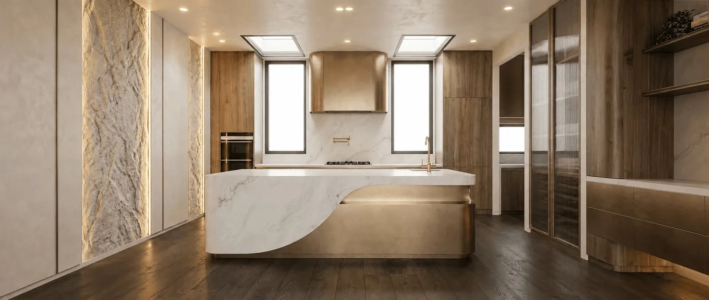
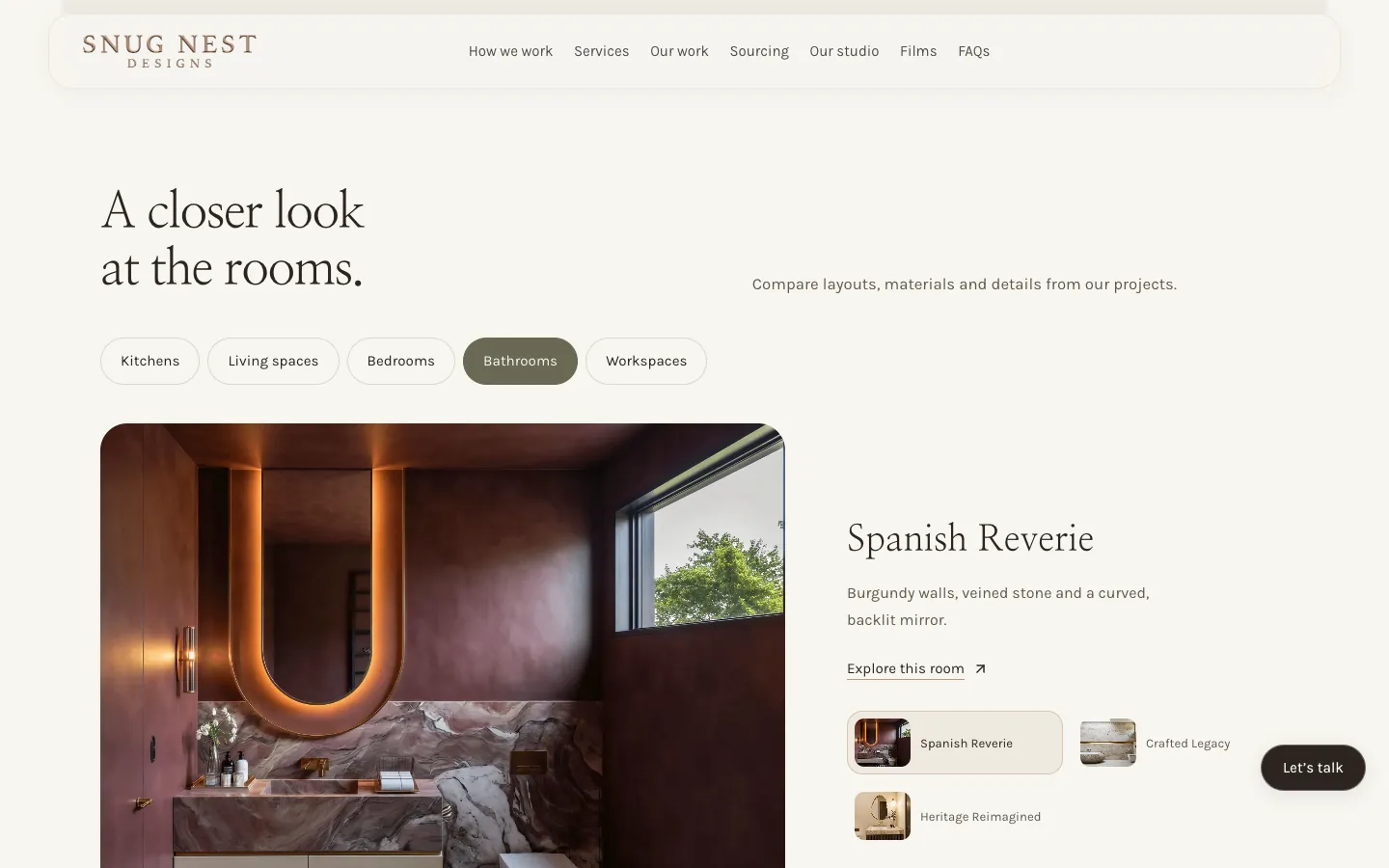
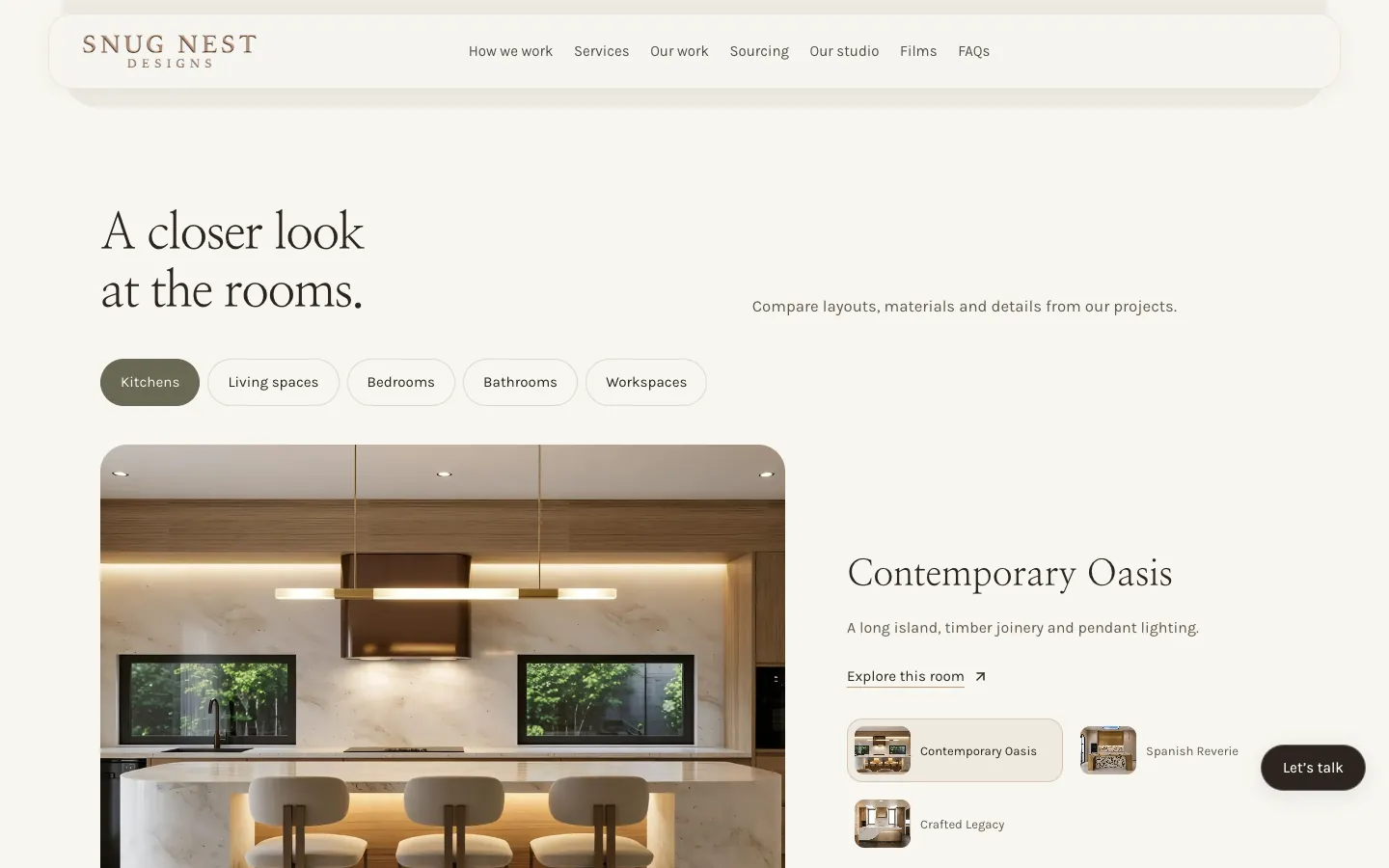
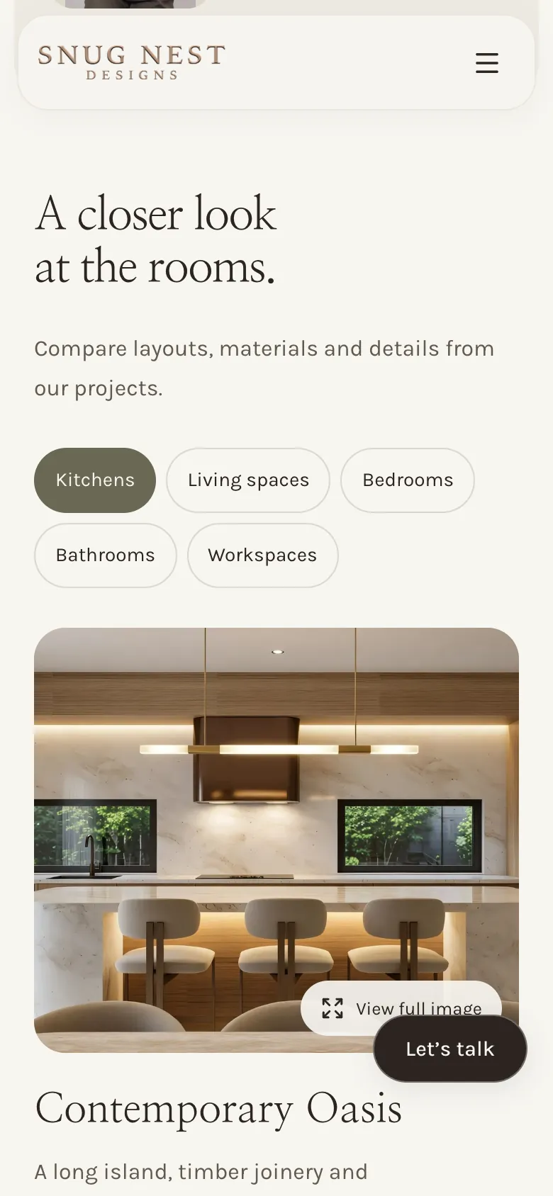
Kitchens, bedrooms, bathrooms and workspaces each hold three homes, and living spaces holds four. Each view pairs a large image with one line on what makes the room, such as a long island, timber joinery and pendant lighting, and a link to explore it.
How it was measured. Project views listed under each room type in A closer look at the rooms, on the live landing page.
The build04
6 → 1
Six buttons, one booking window: the next step looks the same wherever it is taken.
Let's talk sits in the header, under the headline, in the call section and in the footer, and waits in the bottom corner once the header scrolls away. The build-stage panel adds Talk about your build, and all six open the same window, straight onto a calendar for a complimentary 30-minute call.
How it was measured. Each button clicked on the live landing page; every one opened the same booking window. Nothing was booked.
Campaign work · Snug Nest Designs
The campaign behind the enquiries.
See the advertising work for Snug Nest Designs, with the results and measurement explained in each campaign case study.
Campaign case study
Snug Nest Designs: Meta ads with a 25% lower cost per website lead
Snug Nest Designs cut its cost per website lead from Meta ads by 25% over the full run of the campaign we rebuilt. All ads now go to book.snugnestdesigns.com.
The real pages on desktop and phone. Select any screenshot to see it full size.
Snug Nest Designs — desktop
The home page, top to bottom
Snug Nest Designs — home page
The whole home page, top to bottom. Click or tap the frame to scroll it yourself.
The details that matter, 1 of 2
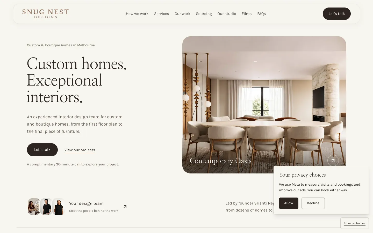
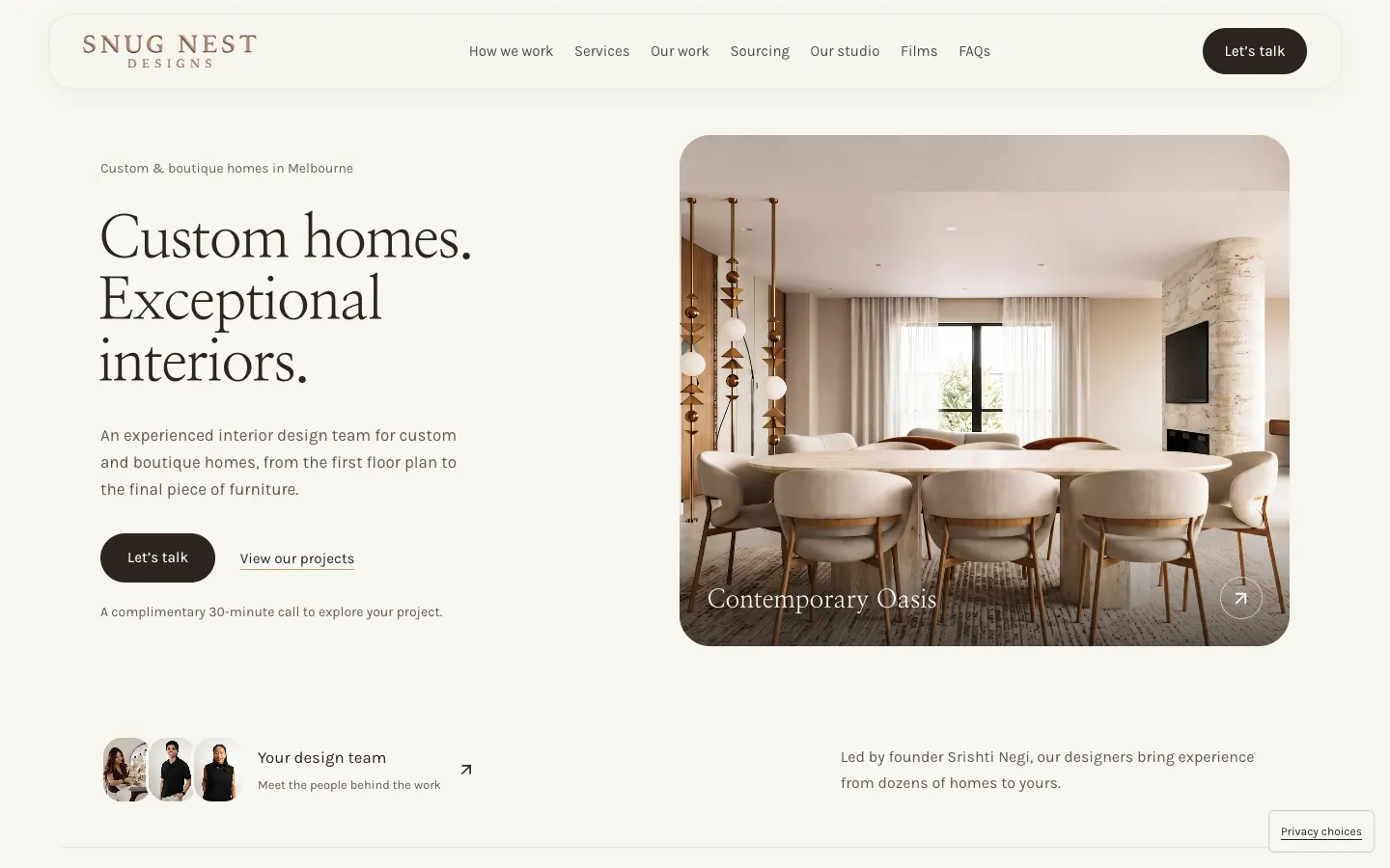
1Seven links in one row How we work, Services, Our work, Sourcing, Our studio, Films and FAQs, with Let's talk set apart on the right.
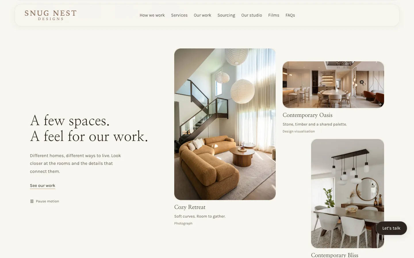
2A two-line headline Set large in a light serif, under a small line placing the studio's custom and boutique homes in Melbourne.
3One next step Let's talk opens the booking window. The line beneath says what it is: a complimentary 30-minute call to explore the project.
4The work beside the words A dining room from Contemporary Oasis fills the right of the first screen and opens that project.
5Your design team Three portraits and a link to meet the people behind the work, before the visitor has scrolled.
The details that matter, 2 of 2
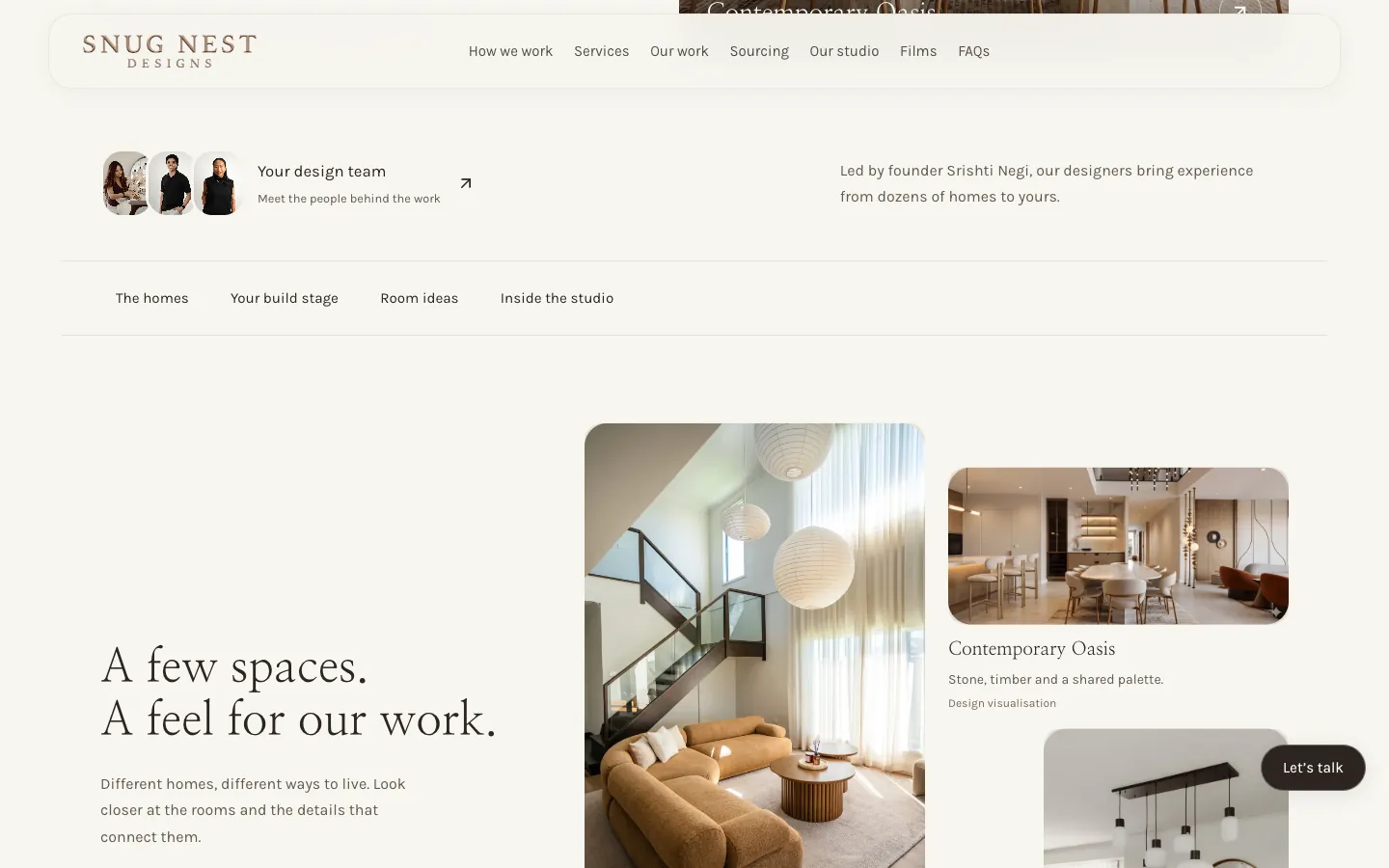
1Meet the team The portraits and Your design team link through to the studio page.
2Led by the founder One sentence: the designers are led by the studio's founder and bring experience from dozens of homes.
3Four ways in The homes, Your build stage, Room ideas and Inside the studio jump straight to those parts of the page.
4Labelled honestly Each collage image says what it is. Contemporary Oasis is a design visualisation; Cozy Retreat and Contemporary Bliss are photographs.
5Let's talk stays close Once the header scrolls away, Let's talk waits in the bottom corner.
Website showcase
A closer look at the website.
Explore Snug Nest Designs’ website, from the first impression to the details.
Use the left and right arrow keys to browse screenshots. Home goes to the first screenshot and End goes to the last.
A few spaces — Three homes in a collage, each labelled as a photograph or a design visualisation, with a control to pause the motion.
01 / 12 · A few spaces — Three homes in a collage, each labelled as a photograph or a design visualisation, with a control to pause the motion.
Inside the website
The thinking behind the pages.
01 · Website detail
The homes come first
The page opens on a room and keeps returning to the work: a collage of three homes, six homes to explore and sixteen room views.
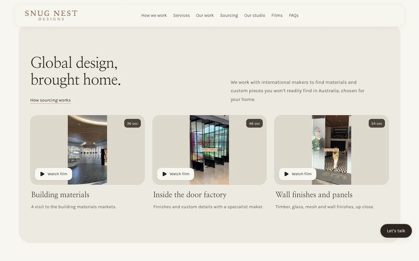
Three films from the building materials markets, a door factory and wall finishes up close: the sourcing behind materials and custom pieces from international makers.
Snug Nest Designs is a Melbourne interior design studio for custom and boutique homes, led by its founder.
Interior design · Melbourne, VIC
SoudCoh services
Landing page design and build
Project and room galleries
Build-stage advice
In-page film player
Call booking
What we put in place
The website experience
One landing page that walks through 12 homes, with sixteen room views across five room types.
A build-stage picker with its own advice and a founder film for each of four stages.
21 films that play in place, with transcripts and the next film queued.
One booking window behind every Let's talk button, with a calendar in Melbourne time.
Website experience
The first screen — A two-line headline, Let's talk, the complimentary 30-minute call and a dining room from Contemporary Oasis, all in one view.Explore the website screenshots
What the project delivered
The outcome
The studio's Meta ads land on a page that shows the work first and ends in one clear step: a complimentary 30-minute call.
We built Snug Nest Designs a landing page that walks visitors through 12 homes, with 21 films and one quiet way to book a call.
Snug Nest Designs is a Melbourne interior design studio for custom and boutique homes. Its founder leads the design team, and the work runs from the first floor plan to the final piece of furniture: layouts, finishes, joinery and lighting, with materials and custom pieces sourced from international makers.
12
homes on one page
21
films that play in place
4
build stages, each with its own advice
16
room views in five room types
30 min
complimentary call, booked on the page
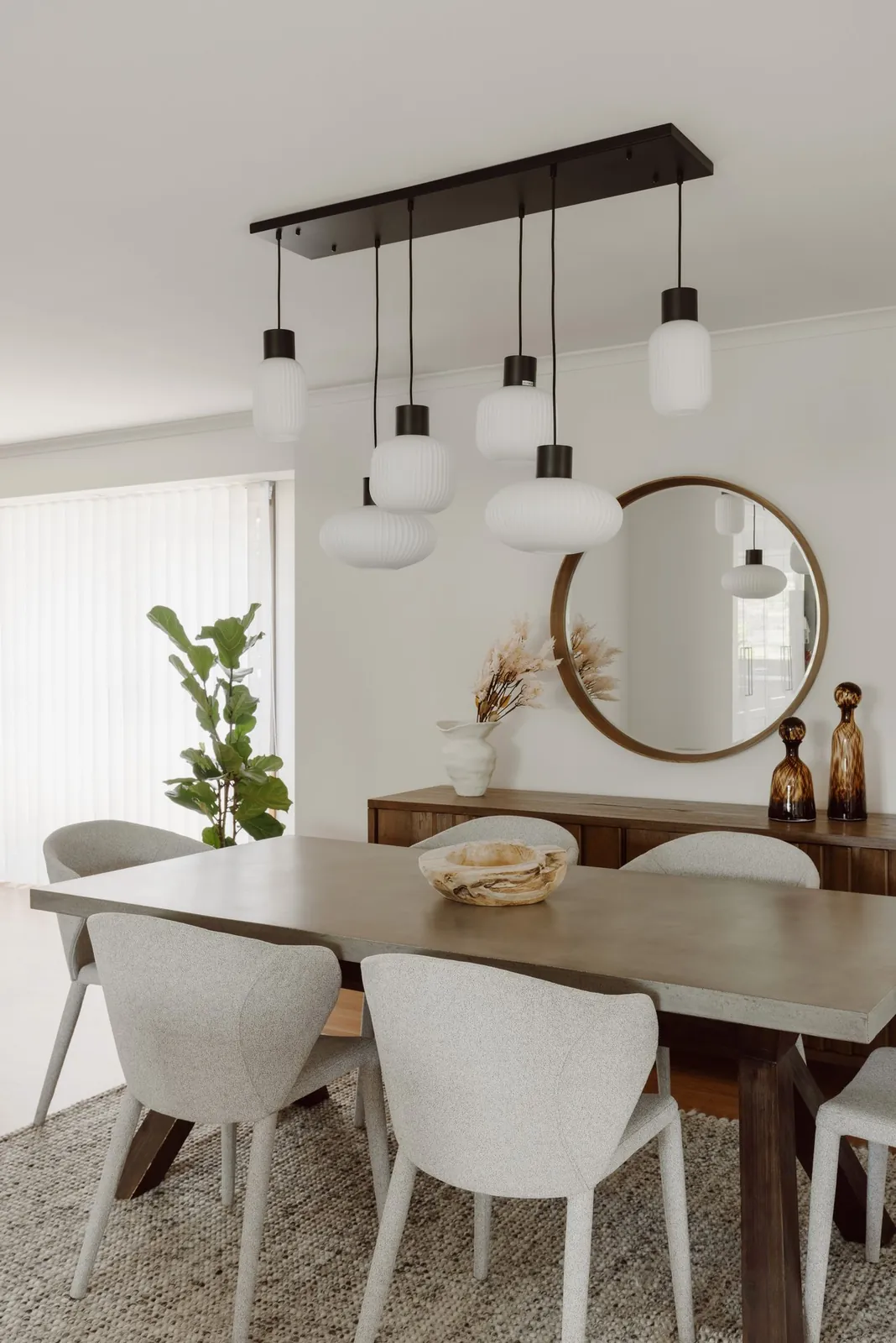
Contemporary Bliss Ribbed glass pendants over a long table, a round timber mirror and soft, textured chairs. A photograph, and one of the three homes in the page's opening collage.
The brief
Commissioning a custom home means a long run of decisions over the course of a build. Some come to a designer while the plans are still flexible. Others are already building, with selections still to make. Either way, they want to see the work, hear how the designer thinks and know what the first conversation involves.
A generic page, with a list of services and a contact form, answers none of that. The brief was one page that could carry the whole studio: the homes, the advice, the people and the sourcing, with a single next step, a complimentary 30-minute introductory call. It also had to work as the landing page for the studio's Meta ads, where a visitor arrives from a single ad and has to understand the studio within a screen or two.
The idea: let the homes do the talking
The page opens on a dining room from Contemporary Oasis and keeps returning to the work. A collage of three homes, Cozy Retreat, Contemporary Oasis and Contemporary Bliss, sits under the line A few spaces. A feel for our work. Explore the homes follows, with Contemporary Oasis and Spanish Reverie set large and Modern Ease, Heritage Reimagined, Crafted Legacy and Cozy Retreat beneath them.
Further down, A closer look at the rooms sets sixteen room views side by side by type: kitchens, living spaces, bedrooms, bathrooms and workspaces. Twelve homes appear across the page in all. The words stay short: a project name, then a single line, such as marble, timber and clean lines bringing warmth to generous spaces.
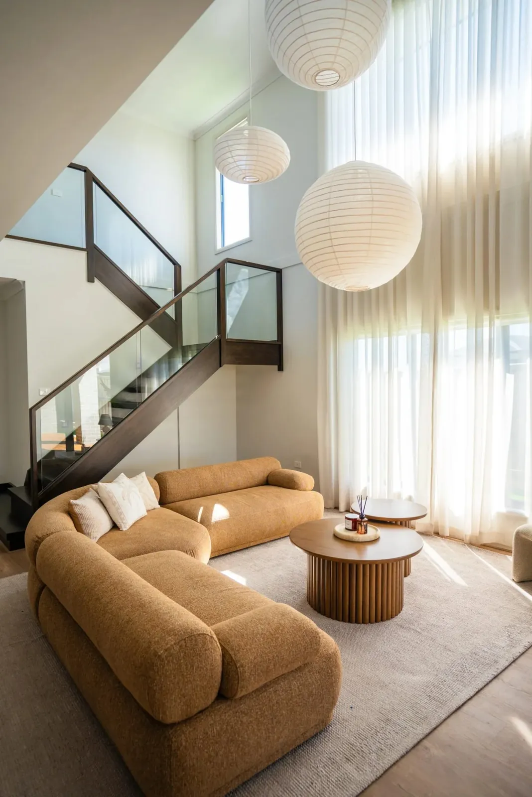
Cozy Retreat Soft curves and room to gather in a double-height living room under paper lanterns. A photograph, and the first image in the opening collage.
The craft
The type is a light serif for headlines and a plain, open sans for everything else, on a warm, pale ground. The palette stays close to the rooms: warm white, stone, timber brown and a deep olive for the invitation to talk. Panels have soft corners, and the spacing is generous enough for each image to be seen on its own.
The images are labelled honestly. In the opening collage, each one says whether it is a photograph or a design visualisation, and a small control pauses the collage's motion. In the room views, every image has a link to explore the room and a control to view it full size.
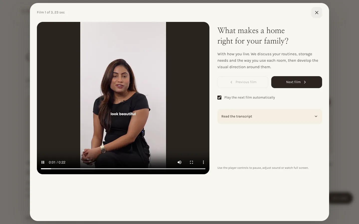
The films play in place, and twenty of the 21 run under a minute. Under Questions we hear often, the founder answers twelve questions in four topics, three films to a topic, each between 21 and 31 seconds, with the written answer printed beneath. A film opens in a window over the page that shows which of the three is playing, steps to the next, can play on automatically and opens a transcript. Three sourcing films go to the building materials markets, inside a door factory and up close to timber, glass, mesh and wall finishes, and a 45-second film sits at the studio table during a colour appointment.
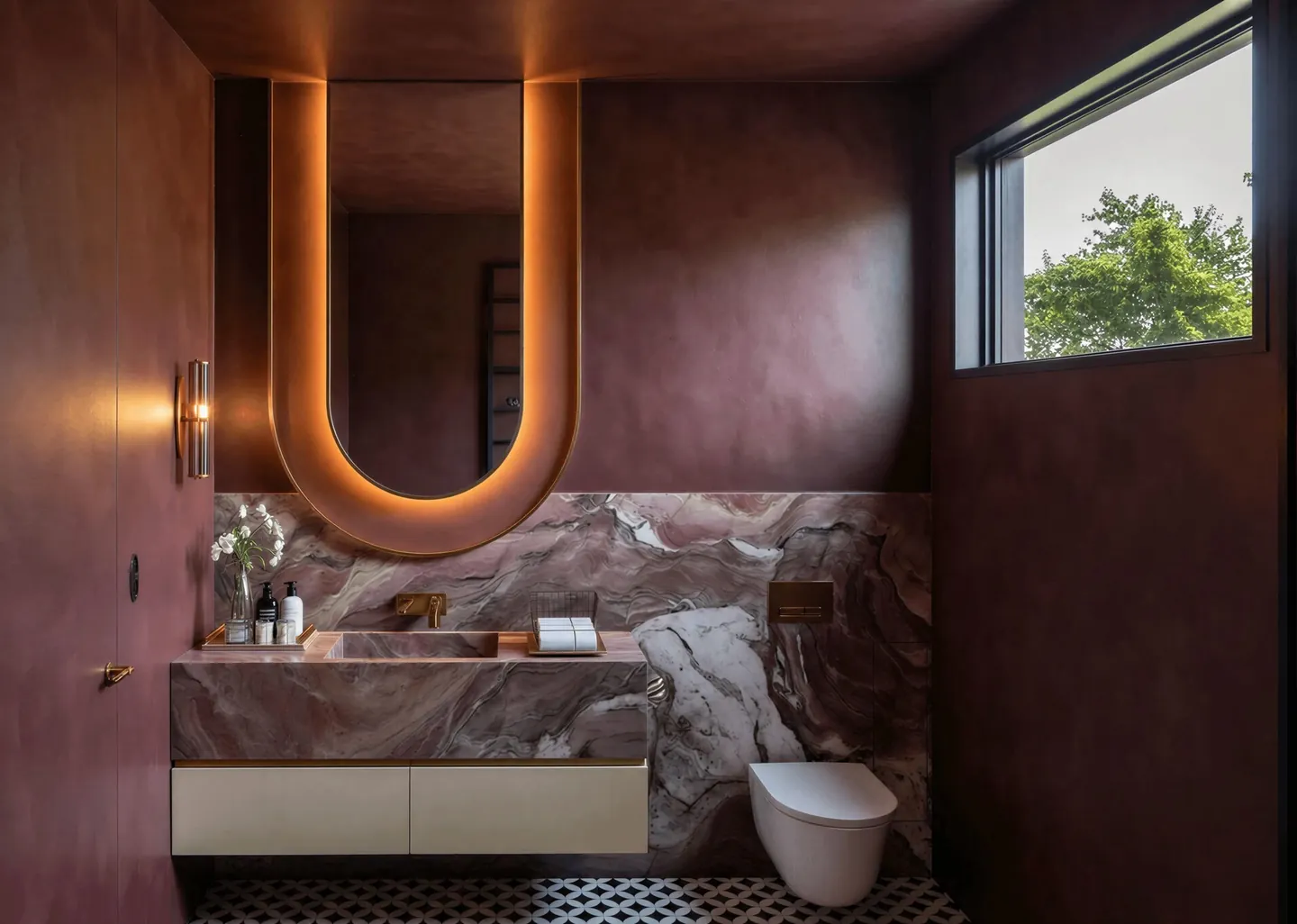
Spanish Reverie Burgundy walls, veined stone and a curved, backlit mirror, shown under Bathrooms in the page's room views. A design visualisation.
One decision for the visitor
Every path on the page ends in the same place. Let's talk sits in the header, under the headline, in the call section and in the footer, and once the header scrolls away it waits in the bottom corner. The build-stage panel adds Talk about your build. All six buttons open the same booking window.
That window opens straight onto a calendar, with no form to fill first. It describes a complimentary 30-minute call with the team to understand the project, see if the studio can help and discuss the next steps: 30 minutes, with no obligation, and times shown in Melbourne time. Shaded dates have available times.
The page also does some of the first call's work in advance. Where are you in your build? offers four stages: planning your home, making selections, already building and getting the keys. Each brings up its own advice and a founder film of 20 to 28 seconds, and the page notes that the chosen stage will be kept in mind at booking. Before you book answers when to get in touch, whether a finished brief is needed and how to see more first, and anyone already booked has a link to their call guide.
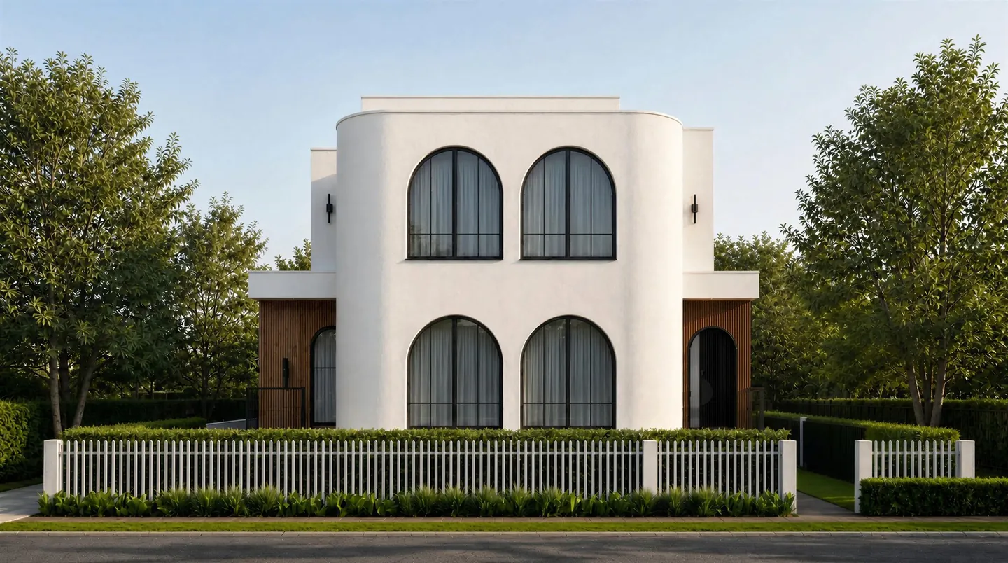
Spanish Reverie Arched windows, white render and timber battens. The image beside the invitation to talk, linking to the project. A design visualisation.
Where the ads land
This is the page the studio's Meta advertising sends people to. When we captured it, all 86 active ads in the studio's campaign for booked calls pointed here. So the first screen does the whole job in one view: the headline, a room from Contemporary Oasis, Let's talk and a line explaining the call.
It asks permission plainly. A small privacy note says Meta is used to measure visits and bookings and improve the ads, offers Allow and Decline, and adds that the visitor can book either way. Before a choice is made, the page makes no request to Meta.
From there, a visitor can go as deep as they like, through the homes, the stages, the rooms and the films, and the way to book stays a single tap away the whole time.
Key design decisions+
Twelve homes appear on one page, from the opening dining room to sixteen room views across five room types.
Advice is organised by build stage, from planning your home to getting the keys, each with a short founder film.
Twenty-one films play in place, twenty of them under a minute, with a transcript and the next film queued.
Six buttons lead to one booking window for a complimentary 30-minute call in Melbourne time.
Every active ad in the studio's Meta campaign for booked calls lands on this page.
Tags
Website design
Interior design
Melbourne, VIC
A website built around your business.
Tell us about your services, your customers and the next step you want them to take. We will shape the design and page structure around that brief.
The landing page the studio's Meta ads send people to: one long page that walks through 12 homes, offers advice for each stage of a build, plays 21 films and ends in a complimentary 30-minute call, booked without leaving the page.
Why lead with the homes rather than a list of services?
Someone choosing an interior designer for a custom home wants to see how the rooms feel before anything else. The page opens on a dining room from Contemporary Oasis and keeps returning to the work, with each collage image labelled as a photograph or a design visualisation.
What does the page offer someone who is already building?
A stage picker. Planning your home, making selections, already building and getting the keys each bring up their own advice, a short film from the founder and a button to talk about the build. The page notes that the chosen stage is kept in mind at booking.
How does a visitor book a call?
Every Let's talk button, including the one that waits in the corner as the visitor scrolls, opens the same booking window. It opens straight onto a calendar for a complimentary 30-minute call, with times in Melbourne time and shaded dates showing open times.
How does the page handle Meta measurement?
A small privacy note explains that Meta is used to measure visits and bookings and improve the ads, with Allow and Decline buttons, and says plainly that the visitor can book either way. Before a choice is made, the page makes no request to Meta.
Which ads send people to this page?
When we captured the page, all 86 active ads in the studio's Meta campaign for booked calls pointed to it, so the first screen is built to do the whole job in one view.
— 09 · Read next
There are dozens more of these.
Every study we have published sits in the library, filterable by industry and by the work involved.