Proof
    Aussie Plumbing — ad spend scaled 1.8× with enquiries up 2.1×, so each enquiry cost lessI-ELEC — a 231-page electrician website for Inner SydneyWhat a plumbing lead costs on Google AdsWhat a lead costs on Google Ads, industry by industrySLS Solicitors — cost per recorded Google Ads conversion down 58.48%Wilco Plumbing — search campaigns and service pagesWilco Plumbing — service menus and guided enquiriesHow much should a trade business spend on marketing?State Choice Plumbing — a drains, hot water and gas websiteAussie Drains — a 600-page drain website for SydneyWhat an electrician lead costs on Google AdsAussie Electrical — a 650-page electrical website for SydneyThe most efficient ways for a trade business to get leadsEOL Melbourne — click-to-enquiry rate up from 28% to 33.4%What a cleaning lead costs on Google AdsAlliance Plumbing — ad spend scaled 1.8× with enquiries up 2.1×, so each enquiry cost lessImpress Blinds — cost per recorded Google Ads conversion down 62.63%FixCare Property - cost per enquiry down 28%Rubbish Removal WA — cost per enquiry down 53.18%Floral Cakery — cost per enquiry down 49.82%ILLUMINATE Laser Emporium — cost per enquiry down 48.54%Sydney Fence Painting — cost per enquiry down 33.68%Alliance Plumbing — cost per enquiry down 29.6%Gridless Build Solutions — cost per enquiry down 29.16%FacilityWorx — cost per enquiry down 23.62%Cornerstone Roofing — cost per enquiry down 20.47%Council finance — budgeting and workforce designCouncil planning — clearer approvals and reportingCultural audiences — media strategy and creative conceptsCommunity participation — surveys, maps and project pagesPublic-sector research — survey design and analysisPublic art — site studies and visual conceptsRegional identity — visitor guides and wayfinding conceptsCouncil systems — integration and migration planningA pressure washing business — service-led search campaignsA pressure washing business — a clear enquiry journeyA carpet cleaner — Google Ads built around cleaning servicesA roofing company — campaigns for repairs and restorationA CCTV installer — campaigns for security enquiriesA fence painter — search campaigns for specific surfacesA maintenance business — live in 8 weeks, 3 stacks gone5.0 across every Google review$120M+ in media under management250+ active engagements across five countries
    ILLUMINATE Laser Emporium

    Laser and skin clinic · Malvern East, VIC

    Illuminate Laser Emporium: a clinic website with treatment facts, prices and booking

    We built nine treatment pages, each opening with quick facts and carrying its own price list. We also added a booking card on the home page, the contact page and every treatment page that explains the handover to the booking platform.

    Visit website
    Services
    Website design and build · Treatment pages · Booking card design · Pricing page · Google Ads landing pages
    Talk to us about your website

    The case study

    In this case study

    White paper · PDF

    Marketing for home services in Australia

    58 pages · 2.3 MB

    Download this PDFRead it on the page

    We built nine treatment pages, each opening with quick facts and carrying its own price list. We also added a booking card on the home page, the contact page and every treatment page that explains the handover to the booking platform.

    The business

    Illuminate Laser Emporium is a laser and skin clinic on Waverley Road in Malvern East. It offers nine treatments, including skin needling, IPL pigmentation and acne treatment, super hair removal, RF skin tightening, carbon laser facials, body sculpting and laser tattoo removal. The same practitioner runs the consultation and every session after it, and appointments are booked through the clinic's online booking platform.

    The brief

    People choosing a skin clinic want to know a few things before they commit: what the treatment does, how many sessions it takes, what it costs and who will be holding the handpiece.

    The brief was to put those answers on the page, treatment by treatment, rather than leave them for a phone call, and to make booking a consultation as easy from a treatment page as from the home page. The site also had to work as the landing page for the clinic's Google Ads, where most enquiries come from people on a phone.

    A booking card on every treatment page

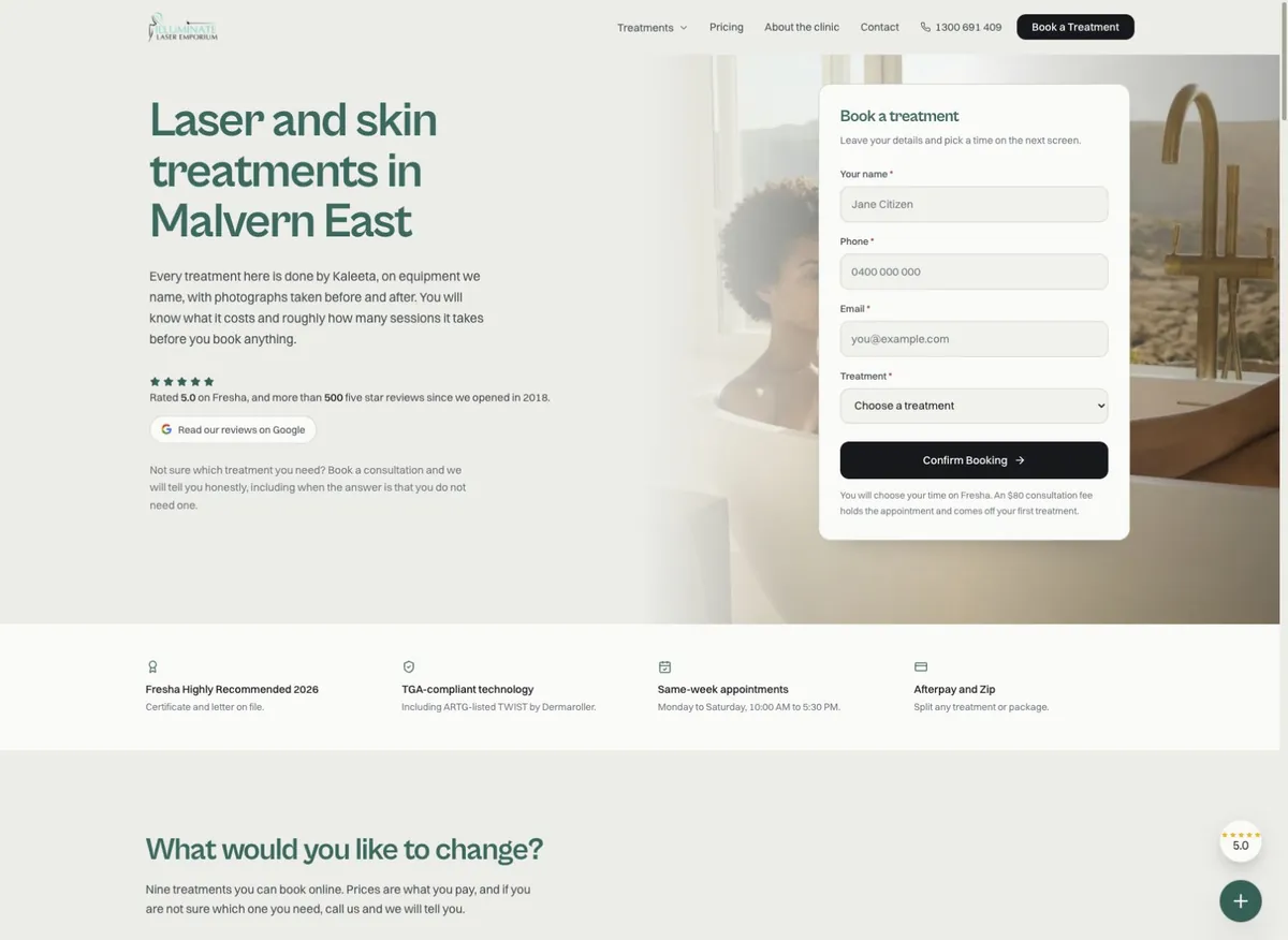
    The same short booking card appears on the home page, the contact page and every treatment page: name, phone, email and the treatment, which arrives already chosen on a treatment page. The card says what happens next: the time is picked on the following screen, and the consultation fee comes off the first treatment. On the home page the card can switch between face and skin treatments and body treatments.

    Nine treatment pages that answer the first questions

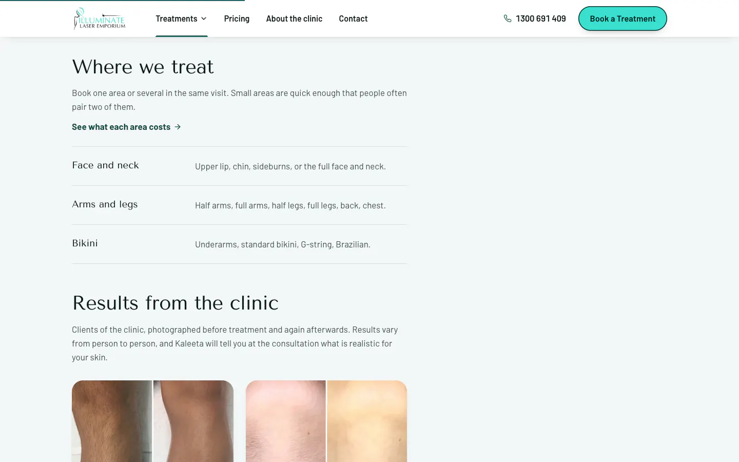
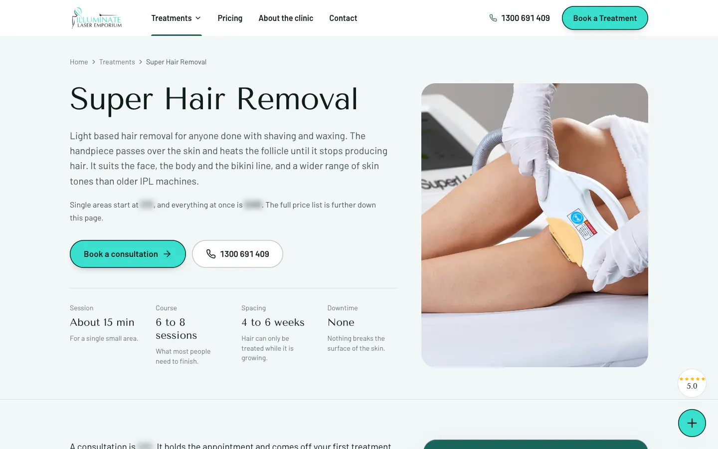
    Each treatment page opens with a plain explanation and a strip of quick facts. For super hair removal that means about 15 minutes a session, six to eight sessions, four to six weeks apart and no downtime. Below that, the page explains how the treatment works, shows results from the clinic and answers the questions people ring up to ask, and some pages add the areas that can be treated.

    Each page then repeats its own price list and the booking card, shows the clinic and links to the other treatments.

    Prices in full

    The pricing page lists every treatment and package in full, area by area, with a bar of jump links that stays in view as the visitor scrolls. A card explains where the consultation fee goes, and a short section covers paying on the day or in instalments. The Treatments menu shows each treatment's starting price, so the range and the cost can be read before a single click.

    The clinic, the practitioner and the equipment

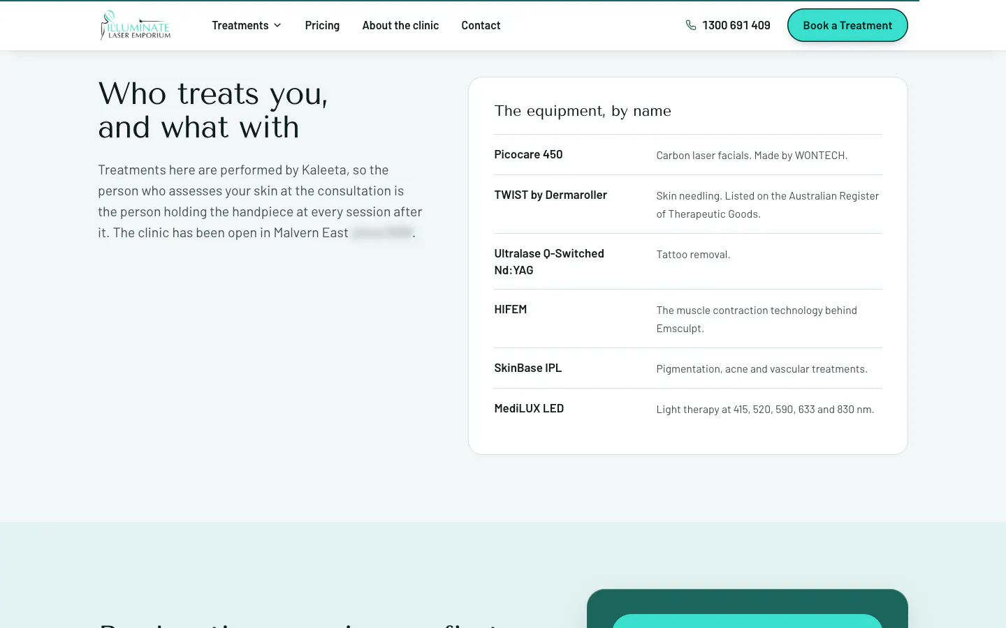
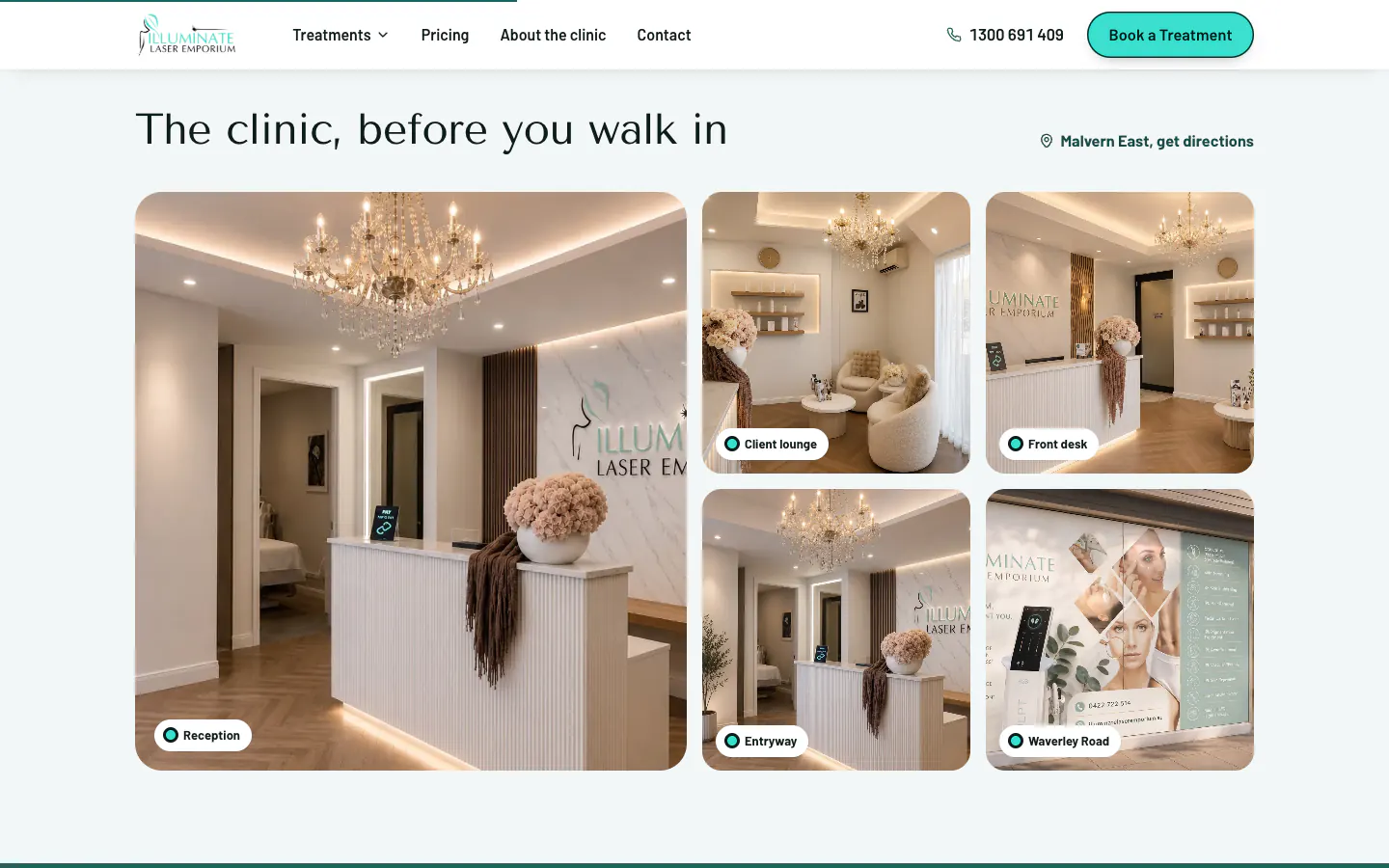
    The home page shows the clinic before anyone walks in: five labelled photos from the street front to the client lounge. A section headed Who treats you, and what with explains that the practitioner who assesses the skin is the one who treats it, and lists six machines by name with what each one is used for. Before-and-after photos from the clinic can be filtered by treatment, and the clinic's reviews are shown with a link to read every one.

    Directions a first visit needs

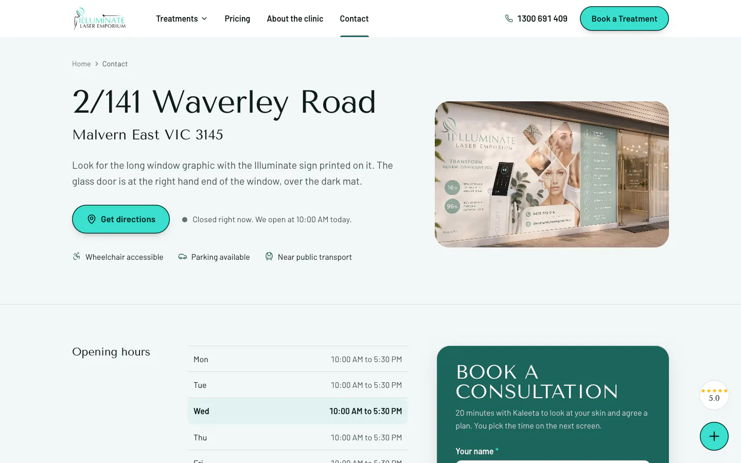
    The contact page leads with the street address and a description of the shopfront to look for, shows whether the clinic is open at that moment, notes wheelchair access, parking and public transport, and lists the opening hours with today highlighted. The cancellation and refund policies, the privacy policy and the terms and conditions each have their own page.

    Built for phones

    On a phone, the header keeps the logo, a call icon and the menu. The home page leads with the headline, a tap-to-call number and the clinic's rating, with the booking card straight after.

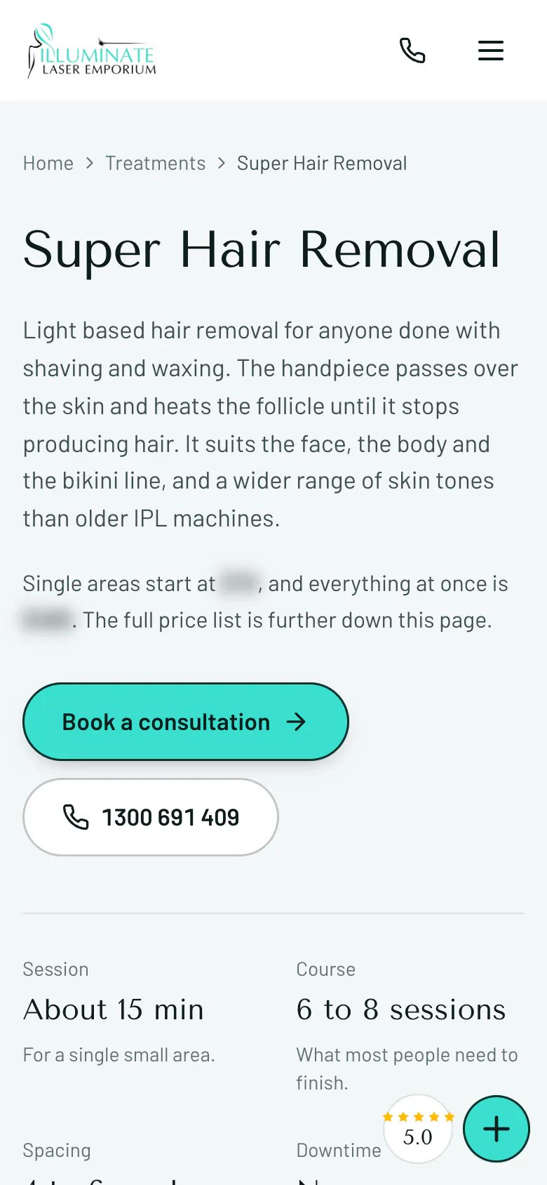
    Treatment pages put Book a consultation and the call button first, then the quick facts. A floating button keeps the clinic's rating and contact options in the corner of the screen.

    What it connects to

    The site is where the clinic's Google Ads land. Calls and booking requests from the ads are recorded, so the campaign is judged on enquiries rather than clicks.

    Since calls and forms were both tracked, one in 13 ad clicks became a call or a booking request, and 91% of enquiries came from people on a phone. The Illuminate campaign case study sets out how that was measured.

    For a clinic that wants its treatments explained before the first call, see our website design services.


    Key design decisions
    • Nine treatment pages, each opening with quick facts and carrying its own price list.
    • A booking card on the home page, the contact page and every treatment page that explains the handover to the booking platform.
    • A full pricing page with jump links and a consultation fee explainer.
    • Nine treatment pages, each opening with quick facts such as the number of sessions and the downtime.

    Tags

    • Website design
    • Laser and skin clinic
    • Malvern East, VIC

    A website built around your business.

    Tell us about your services, your customers and the next step you want them to take. We will shape the design and page structure around that brief.

    The work

    Select a screenshot to enlarge it.

    • Illuminate Laser Emporium home page on desktop with the Malvern East headline and a booking card
      Illuminate Laser Emporium home page on desktop with the Malvern East headline and a booking card
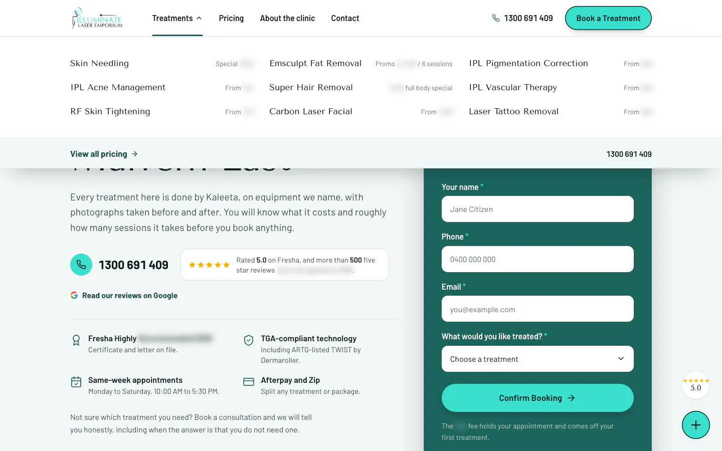
    • Illuminate Laser Emporium Treatments menu listing nine treatments with a link to the full price list
      Treatments menu — All nine treatments with their starting prices, a link to the full price list and the phone number.
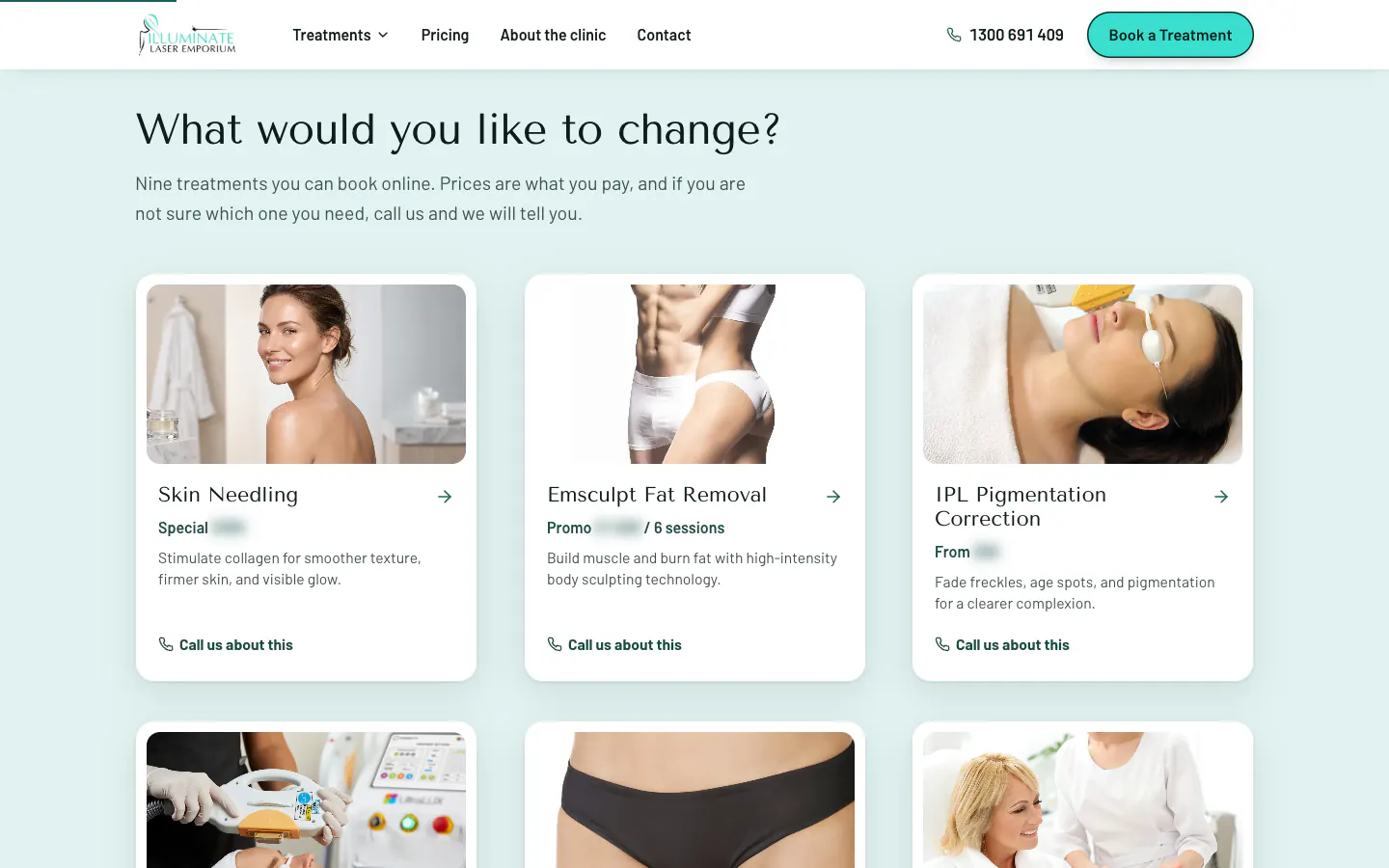
    • Treatment cards on the Illuminate home page, each with a photo, a short description and a call link
      Treatment cards — Nine cards, each with a photo, the starting price, a one-line description and a link to call about it.

    More project detail

    Project highlights

    Project highlights

    What we delivered for Illuminate Laser Emporium.

    A closer look at the services and features delivered. Open a tile for the source behind each detail.

    • Project highlight

      Treatment + price

      service pages connected to the booking platform

      Website delivery

    • 16

      Pages in the site: nine treatments, pricing, contact and four policy pages

      Live sitemap count

    • 9

      Treatment pages, each opening with quick facts and carrying its own price list

      Live sitemap count

    • 11

      Treatments and packages priced in full on the pricing page

      Counted on the live site

    • 6

      Machines named on the site, with what each one treats

      Counted on the live site

    • 5

      Labelled photos of the clinic, from the street front to the client lounge

      Counted on the live site

    Project notes

    Page counts are the unique page addresses in the site's live sitemap. Screenshots show the delivered website. Campaign outcomes, where included, use the periods and definitions in the linked advertising case study.

    Quick summary
    Inside the build

    Insights

    Inside the build

    Details from the Illuminate Laser Emporium project. Open a card for the finding and its source.

    • The build

      9 of 9

      Every treatment page opens with a strip of quick facts, from the course length to the downtime

      Before any sales copy, a strip answers what people ask first: how many sessions most people need, the downtime and, on most pages, how long a session takes. Super hair removal, for example, shows about 15 minutes a session, six to eight sessions, four to six weeks apart and no downtime.

    • The build

      11 of 16

      The booking card says what happens next before anyone fills it in

      The same short card appears on the home page, the contact page and every treatment page: name, phone, email and the treatment. It says the time is picked on the next screen and that the consultation fee comes off the first treatment, so nothing about the handover to the booking platform is a surprise.

    • The build

      6

      The practitioner and six machines are named before the first visit

      A section headed Who treats you, and what with explains that the person who assesses the skin is the person who treats it. It then lists six machines by name with what each one is used for, which answers a question clients often feel awkward asking.

    Full-page and device views
    Design details

    Inside the website

    The thinking behind the pages.

    1. Website detail

      A treatments menu that shows the range at once

      The Treatments menu lays out all nine treatments with their starting prices, and ends with a link to the full price list and the phone number.

      Illuminate Laser Emporium Treatments menu listing nine treatments with a link to the full price list
      Open full-size screenshot
    2. Website detail

      Nine treatments, each with its own card

      On the home page each treatment gets a photo, its starting price, one line on what it does and a link to call about it. Every card opens that treatment's page.

      Treatment cards on the Illuminate home page, each with a photo, a short description and a call link
      Open full-size screenshot
    3. Website detail

      Quick facts before the sales copy

      Every treatment page opens with a strip of quick facts: how many sessions most people need, the downtime and, on most pages, how long a session takes. How the treatment works, results from the clinic and the common questions follow.

      Super hair removal page with a four-fact strip for session length, course, spacing and downtime
      Open full-size screenshot
    4. Website detail

      The practitioner and the machines, by name

      The site says plainly that the person who assesses the skin is the person who treats it, and lists six machines by name with what each one is used for.

      Who treats you section with six machines listed by name and what each one treats
      Open full-size screenshot
    5. Website detail

      The clinic shown before the visit

      Five labelled photos walk through the street front, entryway, front desk, reception and client lounge, with a link to directions.

      The clinic, before you walk in: photos of the reception, client lounge, front desk, entryway and street front
      Open full-size screenshot
    6. Website detail

      Directions a first-time visitor can follow

      The contact page describes the shopfront to look for, shows whether the clinic is open right now, notes access and parking, and highlights today in the opening hours.

      Illuminate contact page with directions to the shopfront, opening hours and a booking card
      Open full-size screenshot
    7. Mobile experience

      A phone layout that leads with booking

      On a phone each treatment page opens with Book a consultation and a call button, then the quick facts, so the next step is never below the fold.

      Super hair removal page on a phone with Book a consultation, a call button and the four facts
      Open full-size screenshot
    Project journey
    ILLUMINATE Laser Emporium

    Campaign work · Illuminate Laser Emporium

    The campaign behind the enquiries.

    See the advertising work for Illuminate Laser Emporium, with the results and measurement explained in each campaign case study.

    Campaign case study

    ILLUMINATE Laser Emporium: 1 in 13 ad clicks became a call or booking

    ILLUMINATE Laser Emporium: 1 in 13 ad clicks became a call or booking. See the campaigns, customer journey and measured results.

    Read the campaign case study
    FAQ

    The questions this raises.

    The brief, the design and how the website supports the wider customer journey.

    The first call is free and there is no deck.

    Book a call
    What is on each treatment page?

    A plain explanation and a strip of quick facts first, then how the treatment works, results from the clinic and common questions, followed by that treatment's prices, the booking card and links to the other treatments.

    How does booking work?

    The booking card asks for a name, phone, email and the treatment. It says the appointment time is chosen on the next screen, on the clinic's booking platform, and that the consultation fee comes off the first treatment.

    Why show the prices in full?

    Clients compare clinics on cost and course length. Listing every treatment and area, with starting prices in the menu, lets people work out the cost before they ring.

    Why name the equipment and the practitioner?

    Clients want to know who will treat them and with what. The site says the person who assesses the skin is the person who treats it, and names six machines with what each one is used for.

    How does the site work on a phone?

    The header keeps a call icon and the menu. Treatment pages lead with Book a consultation and a call button, then the quick facts, and a floating button keeps contact options in reach.

    What did SoudCoh deliver for Illuminate Laser Emporium?

    Nine treatment pages, each opening with quick facts and carrying its own price list. A booking card on the home page, the contact page and every treatment page that explains the handover to the booking platform. A full pricing page with jump links and a consultation fee explainer. Clinic photos, the practitioner's role and six named machines on the home page.

    Ready for your next website?

    Tell us about your business, your services and what your website needs to do. We’ll help you decide what to build next.

    A clear scope, a considered design and a practical next step.